
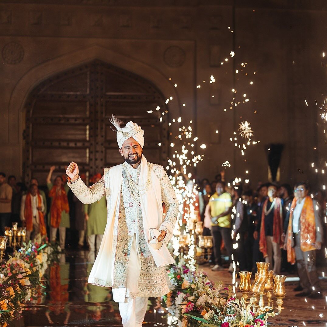
Color in wedding design is not decoration, it is a cue. Guests read a saffron-and-gold mandap as celebratory before a single ritual begins, and they read a dusty-blue-and-ivory reception as calm and contemporary before the first course is served. We plan the color arc of a wedding the way a film colorist plans a movie: each function gets a palette that primes guests for how that specific evening should feel, and the palette shifts deliberately from one function to the next.
Red and Marigold Orange, Built for High-Energy Rituals
Designers have long observed that warm hues read as higher energy and make a space feel busier and more social than it actually is. That is exactly the effect wanted at a mehendi, haldi, or baraat, functions built around movement, music, and a crowd on its feet. Red and marigold-orange textiles, florals, and lighting are used heavily here for that reason, not tradition alone.
Gold, the Constant Thread
Gold is the one color we carry across every single function, because it reads as premium under both harsh daylight and soft candlelight, and it does not clash with whatever accent color a given function is built around. In practice this means the accent color can change from function to function, green and yellow at the mehendi, red at the wedding ceremony, ivory at the reception, while gold thread work, brassware, and marigold keep a visual thread running through the whole photo album.
Cooler Palettes for the Reception, Why More Couples Are Choosing Them
By the time the reception arrives, most guests are on day three or four of a multi-day wedding week. A shift toward blue, teal, and ivory acts as a deliberate wind-down cue after several high-energy functions in a row. It also creates strong visual contrast against Rajasthan's sandstone architecture once uplighting comes on at night, which is part of why this palette has become so popular for reception photography specifically.